Theming
Palettes, fonts, design tokens and live theme switching.
ModernUi resolves every colour, font and metric from resource keys injected into the window when
you call ModernUi.Apply (or construct a ModernWindow). Your own XAML can reference the same keys
with {DynamicResource ...}.
Theme
Theme selects the built-in palette:
ModernUi.Apply(window, Theme.Light); // or Theme.DarkPalette
ThemePalette is the single source of truth for colours. Each property maps to a Brush.* key:
| Property | Light / Dark | Key | Use |
|---|---|---|---|
Background | #f5f5f5#3b4453 | Brush.Background | Window base |
Panel | #d9d9d9#4b5463 | Brush.Panel | Cards / surfaces |
Control | #ffffff#2c3340 | Brush.Control | Input field background |
Foreground | #1e1e1e#f5f5f5 | Brush.Foreground | Primary text |
ForegroundMuted | #6a6a6a#c8c8c8 | Brush.ForegroundMuted | Secondary text |
Border | #c0c0c0#2c3340 | Brush.Border | Dividers / outlines |
Accent | #0696d7#0696d7 | Brush.Accent | Primary buttons, focus |
AccentMuted | #f2f2f2#3a7292 | Brush.AccentMuted | Subtle hover background |
Error | #ec4a41#ec4a41 | Brush.Error | Destructive / error |
Success | #3fb950#3fb950 | Brush.Success | Positive status (optional, has a default) |
Warning | #d29922#d29922 | Brush.Warning | Caution status (optional, has a default) |
Each colour is also exposed as a raw Color.* key (for gradient stops and animations). Success
and Warning are optional record members with library defaults - toasts, the warning dialog icon
and the BadgeSuccess / BadgeWarning styles all follow them.
Custom accent
Copy a default palette and override only what you need:
ThemePalette palette = ThemePalette.Dark with
{
    Accent = (Color)ColorConverter.ConvertFromString("#FF8A00"),
};

ModernUi.Apply(window, Theme.Dark, palette);
Full custom palette
To re-skin completely, build a ThemePalette from scratch - every property is required, so the
compiler makes sure you set all nine colours. Pass it to ModernUi.Apply (or a ModernWindow
constructor, or ModernMessageBox / ModernToast).
using System.Windows.Media;

static Color Hex(string hex) => (Color)ColorConverter.ConvertFromString(hex)!;

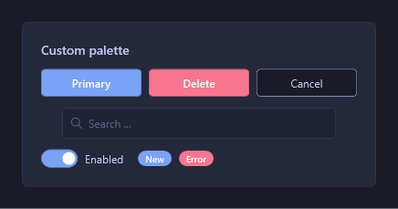
// A "Tokyo Night" palette - nothing to do with the Inventor defaults.
var palette = new ThemePalette
{
    Background      = Hex("#1a1b26"), // window base
    Panel           = Hex("#24283b"), // cards / surfaces
    Control         = Hex("#1f2335"), // input backgrounds
    Foreground      = Hex("#c0caf5"), // primary text
    ForegroundMuted = Hex("#565f89"), // secondary text
    Border          = Hex("#2f334d"), // dividers / outlines
    Accent          = Hex("#7aa2f7"), // primary buttons, focus
    AccentMuted     = Hex("#3d59a1"), // hover / selection
    Error           = Hex("#f7768e"), // destructive / error
};

// The Theme argument only picks a default palette, so it is ignored once you pass your own -
// use either value.
ModernUi.Apply(window, Theme.Dark, palette);
The same controls, rendered under that palette:
Font
FontOptions sets the family and base size, exposed as Font.* keys (Font.Family,
Font.Size.Normal, Font.Size.Small, Font.Size.Title).
// From Inventor's UI font (points are converted to DIPs):
FontOptions font = FontOptions.FromInventor(app.GeneralOptions.TextAppearance, app.GeneralOptions.TextSize);

// Or the Windows system font:
FontOptions fallback = FontOptions.Default;

ModernUi.Apply(window, Theme.Dark, font: font);
Design tokens
Non-colour metrics are static keys you can reuse for consistent spacing and corners:
| Key | Type | Value |
|---|---|---|
Radius.Control | CornerRadius | 4 |
Radius.Card | CornerRadius | 6 |
Size.ControlHeight | double | 30 |
Size.ControlHeightLarge | double | 35 |
Padding.Control | Thickness | 10,6 |
Padding.Card | Thickness | 16 |
Margin.Stack | Thickness | 0,0,0,8 |
<Border Background="{DynamicResource Brush.Panel}"
        CornerRadius="{DynamicResource Radius.Card}"
        Padding="{DynamicResource Padding.Card}">
  <TextBlock Foreground="{DynamicResource Brush.Foreground}" Text="Themed surface" />
</Border>
Switch theme at runtime
ModernUi.SetTheme re-colours an already-themed window live (all styles use DynamicResource, so no
reload is needed):
ModernUi.SetTheme(window, Theme.Light);