Buttons
Default, accent, danger, disabled and icon buttons.
The standard Button is themed implicitly. Three keyed styles cover the common variants.
Default button
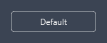
A flat button with a subtle border and hover glow - used for secondary actions.
<Button Content="Default" Width="120" />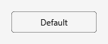
Accent button
The primary action. Apply AccentButton for an accent-filled button with white text.
<Button Content="Primary" Width="120" Style="{DynamicResource AccentButton}" />

States
Buttons show an outward glow on hover and a subtle highlight when pressed (all button styles behave the same way):
| Hover | Pressed |
|---|---|
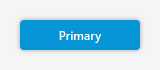 | 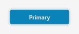 |
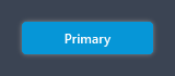
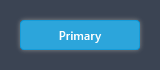
Danger button
For destructive actions (delete, remove). Apply DangerButton.
<Button Content="Delete" Width="120" Style="{DynamicResource DangerButton}" />

Disabled
Disabled buttons dim automatically.
<Button Content="Disabled" Width="120" IsEnabled="False" />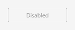

Icon buttons
IconButton is a borderless, compact button for toolbars and in-cell actions. It carries the icon
font (and a 16px size) itself, so a bare glyph string is all it needs (see Icons).
<StackPanel Orientation="Horizontal">
<Button Style="{DynamicResource IconButton}" ToolTip="Settings" Content="" />
<Button Style="{DynamicResource IconButton}" ToolTip="Refresh" Margin="6,0,0,0" Content="" />
<Button Style="{DynamicResource IconButton}" ToolTip="Delete" Margin="6,0,0,0" Content="" />
</StackPanel>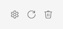
Icon button toolbar
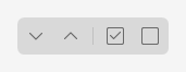
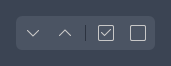
The usual list-header actions — expand / collapse / select all / deselect all — grouped on a panel-tinted surface, with a thin divider between the pairs.
<Border Background="{DynamicResource Brush.Panel}" CornerRadius="6" Padding="3"
HorizontalAlignment="Left">
<StackPanel Orientation="Horizontal">
<Button Style="{DynamicResource IconButton}" ToolTip="Expand all" Content="" />
<Button Style="{DynamicResource IconButton}" ToolTip="Collapse all" Margin="4,0,0,0" Content="" />
<Border Width="1" Height="16" Margin="6,0,2,0" VerticalAlignment="Center"
Background="{DynamicResource Brush.Border}" />
<Button Style="{DynamicResource IconButton}" ToolTip="Select all" Margin="4,0,0,0" Content="" />
<Button Style="{DynamicResource IconButton}" ToolTip="Deselect all" Margin="4,0,0,0" Content="" />
</StackPanel>
</Border>