Text input
Text boxes, the search box, combo boxes and validation.
Text box
The standard TextBox is themed implicitly, with an accent underline on focus.
<TextBox Width="240" Text="Editable text" />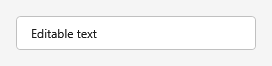

States
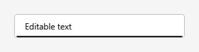
The field reacts to interaction - a muted underline on hover, and an accent underline on focus:
| Hover | Focus |
|---|---|
 |  |


Search box
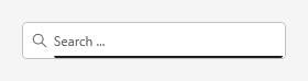
The SearchBox style adds a leading magnifier glyph and a placeholder. The placeholder text comes
from the Tag property, so no extra dependency property is involved - it shows while the field is
empty.
<TextBox Width="240" Style="{DynamicResource SearchBox}" Tag="Search ..." />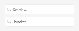

It reacts the same way - the placeholder stays while empty, with the hover and focus underlines:
| Hover | Focus |
|---|---|
 |  |


Filter box (placeholder, no icon)
PlaceholderBox is the same placeholder behavior without the magnifier - for filter, name or path
fields where a search icon would be misleading.
<TextBox Width="240" Style="{DynamicResource PlaceholderBox}" Tag="Filter ..." />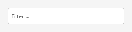

Combo box
<ComboBox Width="240" SelectedIndex="0">
  <ComboBoxItem Content="First option" />
  <ComboBoxItem Content="Second option" />
  <ComboBoxItem Content="Third option" />
</ComboBox>

Disabled
<TextBox Width="240" Text="Disabled" IsEnabled="False" />

Validation
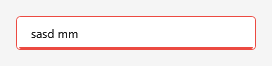
Standard WPF ValidationRules drive a themed error adorner (a red badge with the message in its
tooltip) - no extra wiring beyond the binding rule.
<TextBox Width="240">
  <TextBox.Text>
    <Binding Path="Value" UpdateSourceTrigger="PropertyChanged">
      <Binding.ValidationRules>
        <local:NumberValidationRule ValidatesOnTargetUpdated="True" />
      </Binding.ValidationRules>
    </Binding>
  </TextBox.Text>
</TextBox>