Controls
Display
Progress bars, spinners, loaders, cards and expanders.
Progress bar
The standard determinate ProgressBar is themed (rounded, accent fill).
<ProgressBar Value="60" Maximum="100" Width="280" />

Indeterminate bar
A sweeping band for unknown-duration work. Apply IndeterminateBar.
<ProgressBar Style="{DynamicResource IndeterminateBar}" Width="280" />

Spinner
A rotating arc. Apply Spinner; size it with Width/Height.
<StackPanel Orientation="Horizontal">
  <ProgressBar Style="{DynamicResource Spinner}" />
  <ProgressBar Style="{DynamicResource Spinner}" Width="40" Height="40" Margin="20,0,0,0" />
</StackPanel>

With a label
<StackPanel Orientation="Horizontal">
  <ProgressBar Style="{DynamicResource Spinner}" Width="20" Height="20" />
  <TextBlock Text="Loading…" VerticalAlignment="Center" Margin="10,0,0,0" />
</StackPanel>

Dots loader
Three pulsing dots. Apply DotsLoader.
<ProgressBar Style="{DynamicResource DotsLoader}" HorizontalAlignment="Left" />

Animation timing can't be data-bound in XAML. To change a spinner or bar's speed at runtime, drive
it from a controllable AnimationClock and set clock.Controller.SpeedRatio.
Card
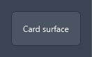
Apply the Card style to a Border for a panel surface with rounded corners and padding.
<Border Style="{DynamicResource Card}">
  <TextBlock Text="Card surface" />
</Border>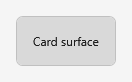
Expander
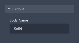
<Expander Header="Output" IsExpanded="True">
  <StackPanel>
    <TextBlock Text="Body Name" Margin="0,0,0,4" />
    <TextBox Text="Solid1" Width="200" HorizontalAlignment="Left" />
  </StackPanel>
</Expander>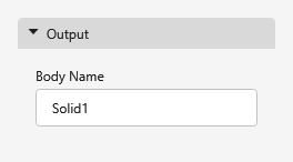
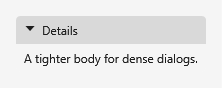
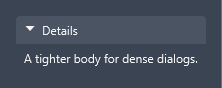
The body uses the Expander's own Padding (default: the Padding.Card token, 16px). Set it on the
control for a compact body:
<Expander Header="Details" IsExpanded="True" Padding="8,6">
  <TextBlock Text="A tighter body for dense dialogs." />
</Expander>