Controls
Badges
Status pills, counter badges and two-tone shields.
Badge styles apply to a ContentControl.
Status badges
Badge (neutral), BadgeAccent, BadgeSuccess, BadgeWarning and BadgeError render pill-shaped
labels, colored from the themed status brushes (Brush.Success / Brush.Warning / Brush.Error).
<StackPanel Orientation="Horizontal">
  <ContentControl Style="{DynamicResource Badge}" Content="Draft" />
  <ContentControl Style="{DynamicResource BadgeAccent}" Content="New" Margin="8,0,0,0" />
  <ContentControl Style="{DynamicResource BadgeSuccess}" Content="Passed" Margin="8,0,0,0" />
  <ContentControl Style="{DynamicResource BadgeWarning}" Content="Check" Margin="8,0,0,0" />
  <ContentControl Style="{DynamicResource BadgeError}" Content="Error" Margin="8,0,0,0" />
</StackPanel>

Counter on a button
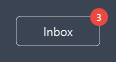
CounterBadge is a small circular count you can overlay on a control.
<Grid HorizontalAlignment="Left">
  <Button Content="Inbox" />
  <ContentControl Style="{DynamicResource CounterBadge}" Content="3"
                  HorizontalAlignment="Right" VerticalAlignment="Top" Margin="0,-8,-8,0" />
</Grid>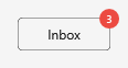
Shield (two-tone)
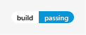
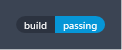
ShieldLabel + ShieldValue form a GitHub-style two-tone badge.
<StackPanel Orientation="Horizontal" HorizontalAlignment="Left">
  <ContentControl Style="{DynamicResource ShieldLabel}" Content="build" />
  <ContentControl Style="{DynamicResource ShieldValue}" Content="passing" />
</StackPanel>