Controls
Layout
Group boxes, separators, tooltips, scroll bars and tab controls.
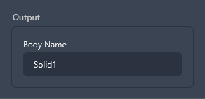
Group box
<GroupBox Header="Output" Width="260">
  <StackPanel>
    <TextBlock Text="Body Name" Margin="0,0,0,4" />
    <TextBox Text="Solid1" />
  </StackPanel>
</GroupBox>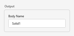
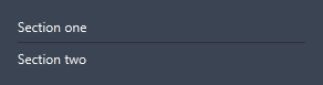
Separator
<StackPanel Width="260">
  <TextBlock Text="Section one" />
  <Separator />
  <TextBlock Text="Section two" />
</StackPanel>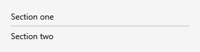
Tooltip
ToolTip is themed (panel surface, theme border and font).
<Button Content="Hover for a themed tooltip"
        ToolTip="Themed tooltip - panel surface, theme border and font." />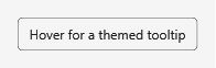

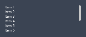
Scroll bar
<ScrollViewer Height="96" Width="260" VerticalScrollBarVisibility="Visible">
  <StackPanel>
    <!-- many items … -->
  </StackPanel>
</ScrollViewer>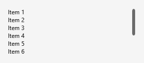
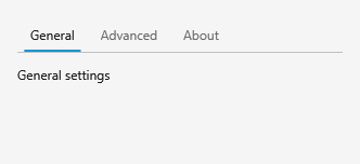
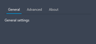
Tab control
<TabControl Width="300" Height="120">
  <TabItem Header="General"><TextBlock Text="General settings" /></TabItem>
  <TabItem Header="Advanced"><TextBlock Text="Advanced settings" /></TabItem>
  <TabItem Header="About"><TextBlock Text="About this add-in" /></TabItem>
</TabControl>