Controls
Selection
Check boxes, toggle switches, radio buttons, list boxes and sliders.
Check box
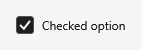
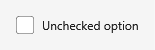
<CheckBox Content="Checked option" IsChecked="True" />
<CheckBox Content="Unchecked option" IsChecked="False" />| Checked | Unchecked |
|---|---|
 |  |


Toggle switch
Apply the ToggleSwitch style to a CheckBox for a switch with a sliding thumb.
<CheckBox Content="On" IsChecked="True" Style="{DynamicResource ToggleSwitch}" />
<CheckBox Content="Off" IsChecked="False" Style="{DynamicResource ToggleSwitch}" />| On | Off |
|---|---|
 |  |


The style also fits a plain ToggleButton (a CheckBox is one) - handy when the switch drives a
command instead of a bound flag:
<ToggleButton Content="Include references" IsChecked="True"
              Style="{DynamicResource ToggleSwitch}" />

Radio buttons
<StackPanel>
  <RadioButton Content="Option one" IsChecked="True" GroupName="demo" />
  <RadioButton Content="Option two" GroupName="demo" />
</StackPanel>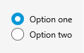
List box
<ListBox Width="240" Height="120" SelectedIndex="0">
  <ListBoxItem Content="Solid1" />
  <ListBoxItem Content="Solid2" />
  <ListBoxItem Content="Surface1" />
</ListBox>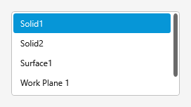
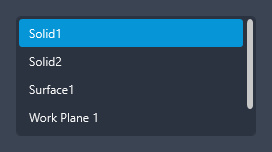
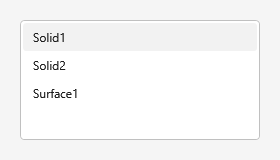
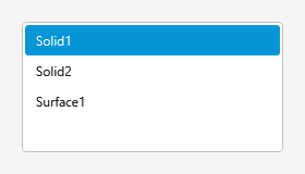
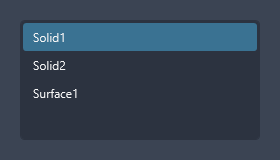
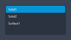
Items highlight on hover and fill with the accent colour when selected:
| Hover | Selected |
|---|---|
 |  |
Slider
The Slider is themed with an accent fill.
<Slider Width="280" Minimum="0" Maximum="100" Value="40" />

The thumb fills with the accent colour on hover:


With a live value
<DockPanel Width="280">
  <TextBlock DockPanel.Dock="Right" Width="32" TextAlignment="Right"
             Text="{Binding Value, ElementName=mySlider, StringFormat={}{0:0}}" />
  <Slider x:Name="mySlider" Minimum="0" Maximum="100" Value="40" />
</DockPanel>

With ticks and snapping
<Slider Width="280" Minimum="0" Maximum="100" Value="40"
        TickPlacement="BottomRight" TickFrequency="10" IsSnapToTickEnabled="True" />

With min / max labels
<DockPanel Width="300">
  <TextBlock DockPanel.Dock="Left" Text="0" Foreground="{DynamicResource Brush.ForegroundMuted}" />
  <TextBlock DockPanel.Dock="Right" Text="100" Foreground="{DynamicResource Brush.ForegroundMuted}" />
  <Slider Minimum="0" Maximum="100" Value="40" AutoToolTipPlacement="TopLeft" />
</DockPanel>
