Controls
Data
Tree views and data grids.
Tree view
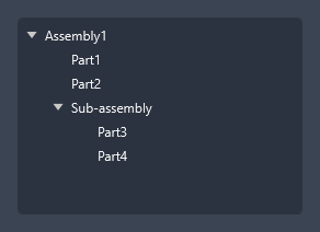
TreeView and TreeViewItem are themed with expand toggles.
<TreeView Width="260" Height="180">
  <TreeViewItem Header="Assembly1" IsExpanded="True">
    <TreeViewItem Header="Part1" />
    <TreeViewItem Header="Part2" />
    <TreeViewItem Header="Sub-assembly" IsExpanded="True">
      <TreeViewItem Header="Part3" />
      <TreeViewItem Header="Part4" />
    </TreeViewItem>
  </TreeViewItem>
</TreeView>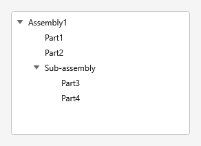
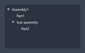
Compact indent
The extra indent of child items is the Margin.TreeIndent token (default 8,0,0,0, on top of the
16px expander column). Override it per tree — or window-wide in the window's resources — for a
compact layout:
<TreeView Width="260" Height="150">
  <TreeView.Resources>
    <Thickness x:Key="Margin.TreeIndent">0</Thickness>
  </TreeView.Resources>
  <TreeViewItem Header="Assembly1" IsExpanded="True">
    <TreeViewItem Header="Part1" />
    <TreeViewItem Header="Sub-assembly" IsExpanded="True">
      <TreeViewItem Header="Part2" />
    </TreeViewItem>
  </TreeViewItem>
</TreeView>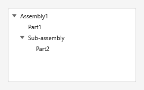
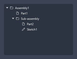
Tree view with icons
Use a glyph TextBlock (or an Image) in the item header for file-type icons.
<TreeViewItem.Header>
<StackPanel Orientation="Horizontal">
<TextBlock FontFamily="Segoe Fluent Icons, Segoe MDL2 Assets" Text="" Margin="0,0,8,0" />
<TextBlock Text="Assembly1" VerticalAlignment="Center" />
</StackPanel>
</TreeViewItem.Header>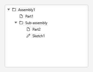
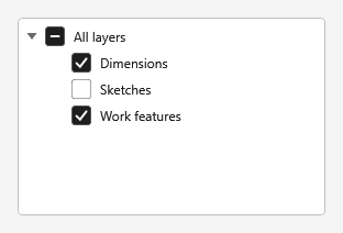
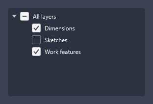
Tree view with tri-state checkboxes
Put a CheckBox in each header and wire the parent/child checked logic in code for tri-state
behaviour.
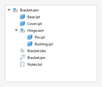
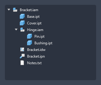
Assembly tree (file-type icons)
The same pattern using the Inventor file-type icons from your resources.
Data grid
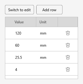
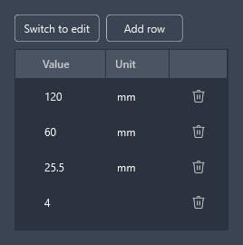
DataGrid is themed (headers, rows, cells). Combine it with the IconButton style for in-cell
actions.
<DataGrid ItemsSource="{Binding Parameters}" AutoGenerateColumns="False" CanUserAddRows="False">
  <DataGrid.Columns>
    <DataGridTextColumn Header="Parameter" Binding="{Binding Name}" Width="*" />
    <DataGridTextColumn Header="Value" Binding="{Binding Value}" />
    <DataGridTextColumn Header="Unit" Binding="{Binding Unit}" />
  </DataGrid.Columns>
</DataGrid>